
Using AI to make survey data more usable
Case Study: Employee engagement reports are powerful, but for many users they’re also overwhelming. My team developed a solution using AI-generated insights to lead into the reporting experience. Grounding interpretation for users with limited time or technical proficiency.
Timeline: On and off for ~3 months
Tools: Figma
Context: Gallup is a global analytics and advisory firm known for its expertise in measuring and improving workplace engagement. Their employee engagement surveys provide organizations with data-driven insights, helping leaders understand and act on what drives their teams. This project focused on making those insights more accessible.
Interpreting the dashboard was a major point of friction
This product serves a wide range of users from executives, to data analysts to frontline managers. They all see the same interface but they have different needs, constraints and supports.
Through feedback from consultants and client success teams, a pattern kept showing up:
Line managers were struggling. They didn’t know where to start, didn’t understand if their team was doing well or not, and didn’t know what to do about it.
A quick win: give users a starting point
We explored a few directions early on. We tried embedding AI summaries throughout the report, adding small insights next to individual charts, and generating contextual explanations per section.
These approaches added value but also added noise and after a few iterations we landed on something simpler:
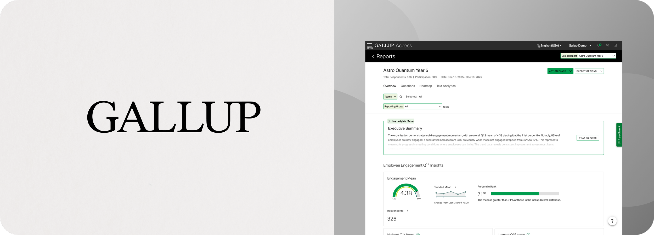
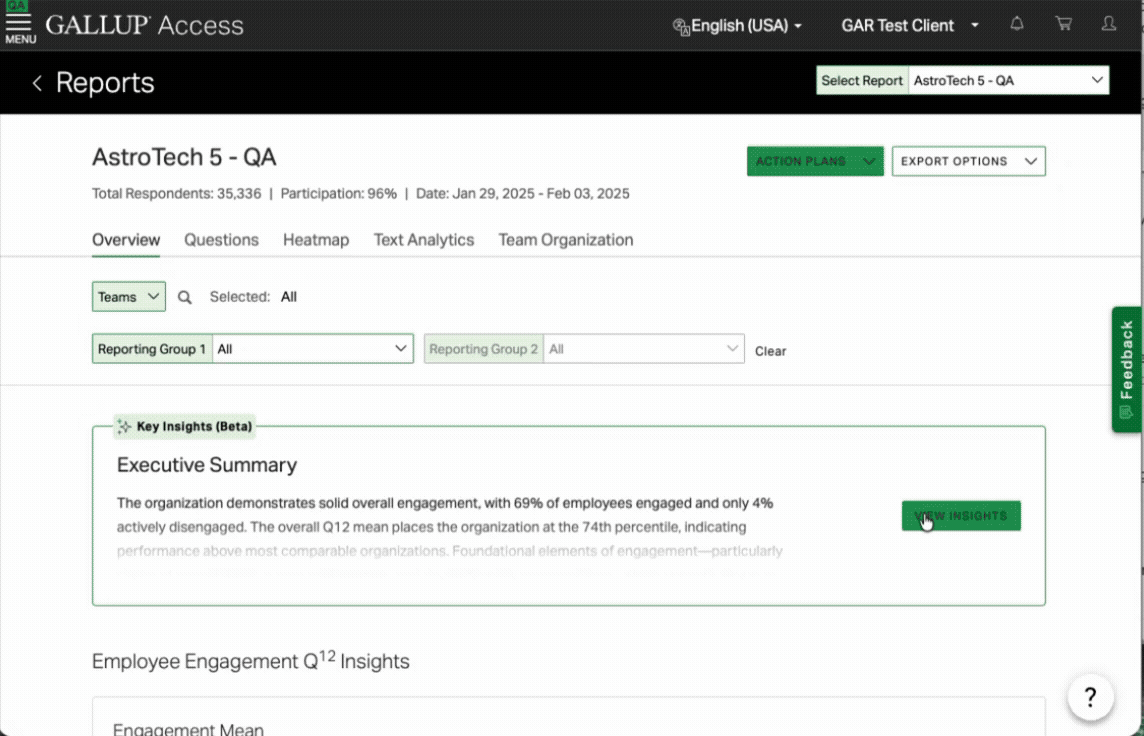
One clear entry point at the top of the report.
A short, AI-generated summary that immediately tells you what’s going on, frames everything that follows, and requires zero effort to discover. It was about giving users a place to start.
Designing for both quick reads and deeper understanding
The final interaction is intentionally minimal:
A single sentence summary by default
An expandable deep dive for more context
This solved two problems at once:
New or busy users can get value instantly
More advanced users can still explore nuance
Instead of designing for a single persona, we designed for different levels of engagement.
Resisting the urge to over-structure the AI
We initially tried forcing structure into the output:
Always include strengths
Always include opportunities
Unfortunately it made the output worse with the summaries being more repetitive and less insightful.
The more we constrained the AI, the less helpful it became.
So we pulled back and allowed more flexibility and prioritizing relevance over consistency.
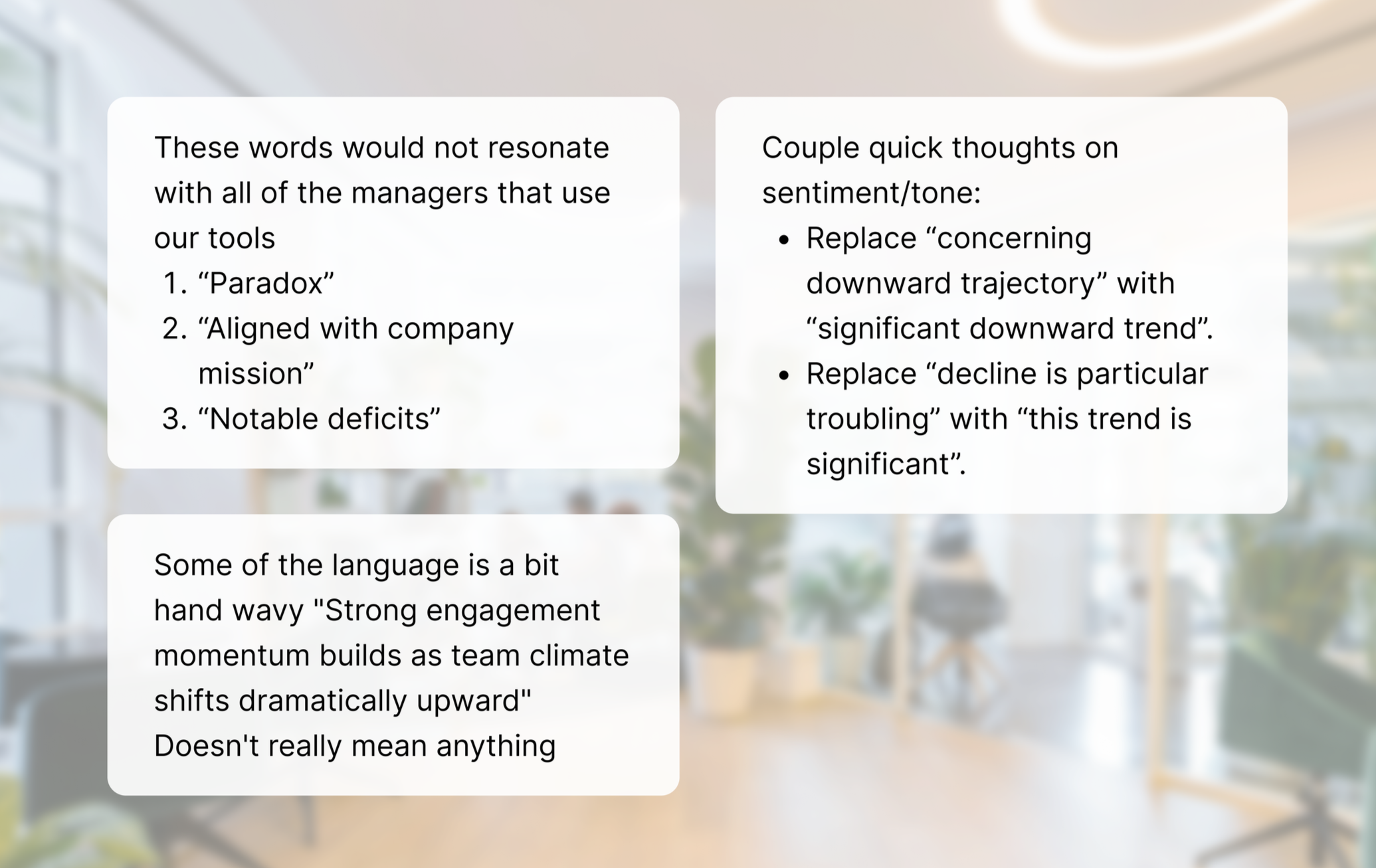
Validation: tone matters more than you think
We tested internally using our own engagement survey results, and while feedback was mostly positive many reviewers felt the tone of the insights missed the mark.
The tone felt too urgent
Some summaries came across as alarmist
We adjusted the language to be more neutral and balanced. It was a small change, but an important one especially when you’re interpreting sensitive employee data.
Early signals (24 hours after launch)
Even with a limited rollout, we saw strong engagement:
~3,000 users viewed reports with AI enabled
~50% expanded and read the full insight
That told us two things:
People noticed it
People found it worth engaging with
For a brand-new entry point, that’s really encouraging.
What’s next
Looking to the future we’re continuing to iterate on response structure and length, tone and clarity, and where AI shows up in the experience. Specifically we’re exploring AI in action planning, which is currently a major drop-off point.
But we’re being deliberate about it. AI is a powerful tool but it’s also expensive, and not always the right solution.
Takeaways
AI is most valuable when it reduces cognitive load, not when it adds features
A strong entry point can completely change how users engage with complex systems
Tone and trust are just as important as accuracy
Sometimes the best design decision is doing less, more intentionally
Have a look at some of my other work
Eleyo Child Care App: Improving efficiency and security by designing against errors.

Travefy Marketplace: Pursuing increased conversion, and new potential revenue streams with a new core feature.